5 Essential Elements for Effective Responsive Web Design
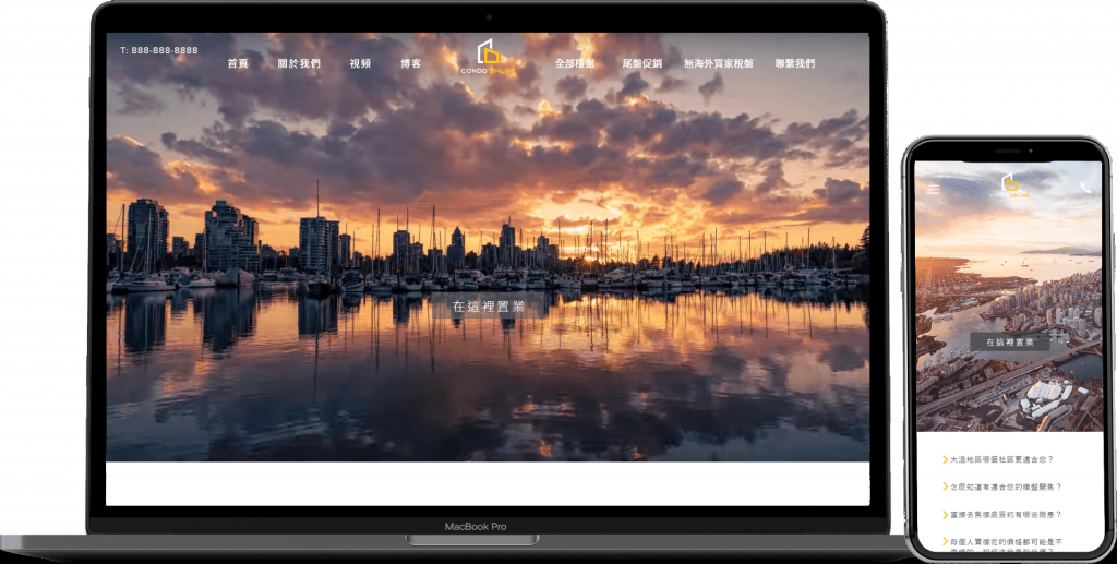
In today’s digital age, having a responsive website is crucial for businesses to stay competitive and engage with their audience effectively. As a leading provider of web design services in Pflugerville, we understand the importance of creating websites that adapt seamlessly to various devices and screen sizes.
Here are five essential elements that we incorporate into our responsive web design projects:
- Mobile-First Approach: By designing with mobile users in mind, we ensure that your website looks great and functions well on smartphones and tablets.
- Flexible Layouts: Our designers create fluid grid layouts that adjust dynamically based on the screen size, providing a seamless user experience.
- Media Queries: We use CSS media queries to apply different styles based on the device’s characteristics, such as width, height, and orientation.
- Optimized Images: We optimize images for faster loading times without compromising quality, ensuring a smooth browsing experience on all devices.
- User-Centric Design: Our focus is on user experience, making navigation intuitive and content easily accessible across devices.
By incorporating these elements into your responsive web design, you can create a website that not only looks stunning but also delivers a superior user experience across all devices. Contact us today to learn more about our responsive web design services in Pflugerville!