Responsive Web Design: Elevate Your Online Presence
In the digital age, having a strong online presence is crucial for businesses of all sizes. A key aspect of this is ensuring your website is visually appealing and user-friendly on all devices. This is where responsive web design comes into play.
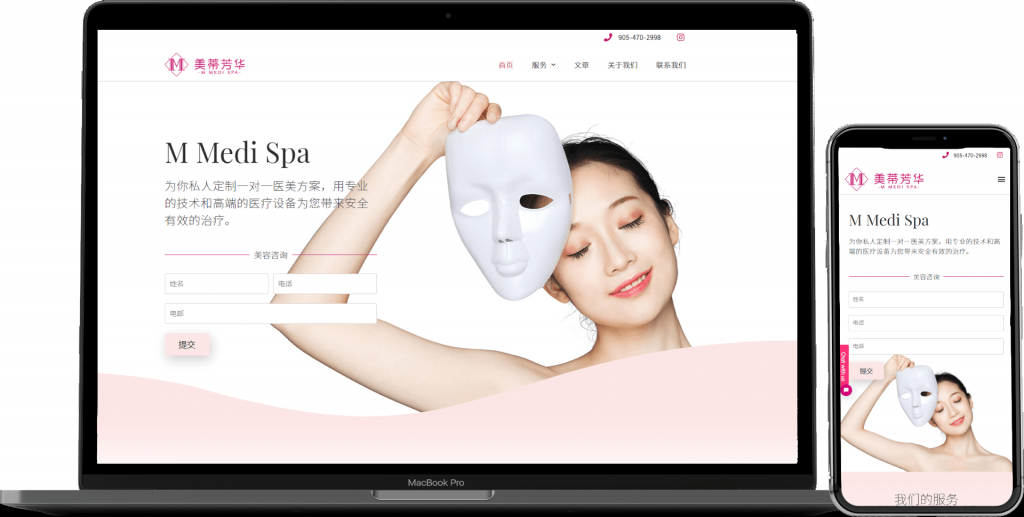
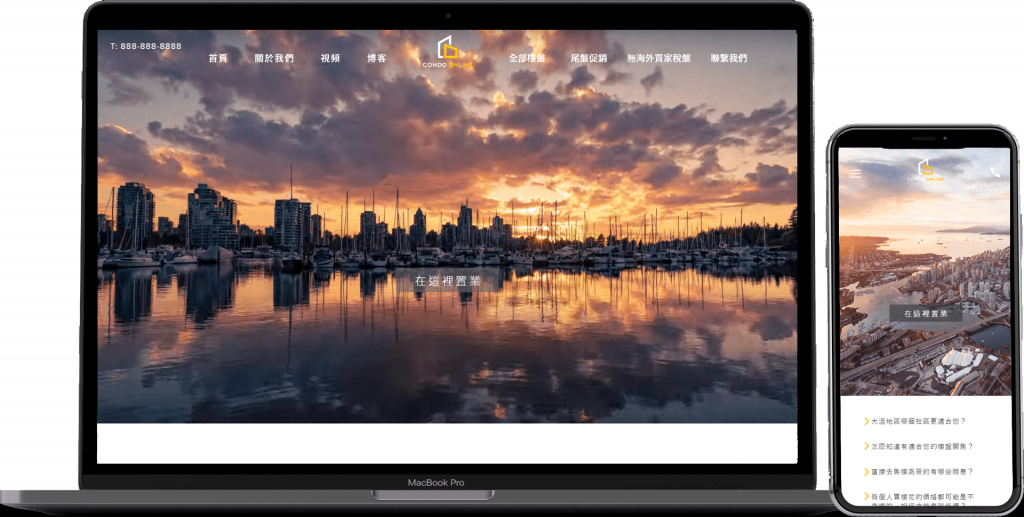
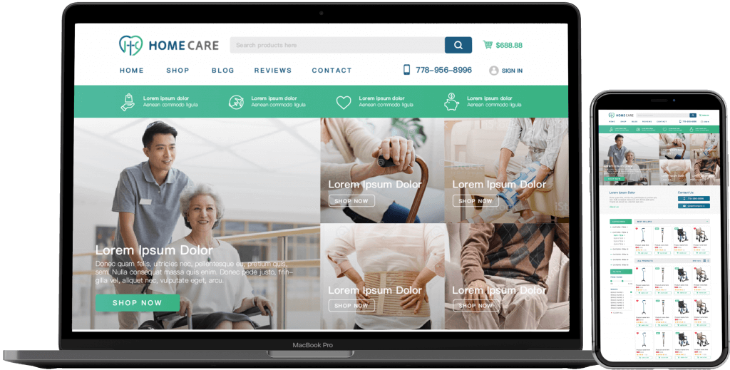
Responsive web design is a design approach aimed at crafting sites to provide an optimal viewing and interaction experience across a wide range of devices, from desktop computers to mobile phones. Not only does it enhance user experience, but it also plays a significant role in search engine optimization.
One of the main advantages of responsive web design is its flexibility. Rather than designing multiple versions of a site for different devices, responsive design allows you to create one site that adapts to the screen size it is viewed on. This ensures that your content looks great and functions well regardless of the device.
When it comes to user experience, responsiveness is key. A site that is not responsive can lead to high bounce rates and lower conversions. Users expect websites to load quickly and be easy to navigate, and responsive design is a fundamental component in meeting these expectations.
“A responsive website is not just about adjusting screen sizes; it’s about creating an optimal user experience regardless of device.” – Web Design Expert
Tips for Implementing Responsive Web Design:
- Use fluid grids that can adapt to any screen size.
- Optimize images and media for faster loading times.
- Utilize CSS media queries to apply different styles based on screen size.
- Test your site on various devices to ensure compatibility.
- Stay updated with the latest trends in responsive design.
As technology continues to evolve, having a responsive website is no longer optional—it’s a necessity. By investing in responsive web design, you not only improve user experience but also show visitors that you are a forward-thinking and professional business.