
Hey web designers. What’s up? Welcome back to the blog posts where a Vancouver web design professional teaches you how to do amazing web design. Today we’re going to talk about colors, something that I’ve struggled with for years. Let me get started by saying that if you’re kind of new to design, don’t feel confident yet, or if you are kind of overwhelmed by how I combine colors together, the one takeaway that I can give you from reading this blog before we dive into the practical stuff is this: The less colors you use, the less likely you are to make mistakes. The best tip I can give you when you just started is just try to keep it simple.
Read the previous post: Web Design Tools.
Beginner’s Mistakes | Vancouver Web Design
As I review a lot of people’s work, the most common thing I see is that people, pretty early on in their career, don’t really understand how colors work together and how to fit them together. They want to create good color palettes but then they try to cram too many colors into their website and that just creates mistakes. In order to avoid mistakes, just try to use less colors. Now, I’m going to show you how to do this. Some people think that there’s something magical or artistic about combining color and in a sense there is a bit of taste. Yes, I kind of have an eye for that. However, combining colors together and creating a palette is actually, in a sense, very technical and mathematical. There are very known relationships between colors that just look good together. There’s a bunch of tools that can help you do that.
Learn more about web design from free videos and tutorials. Visit our YouTube Channel!
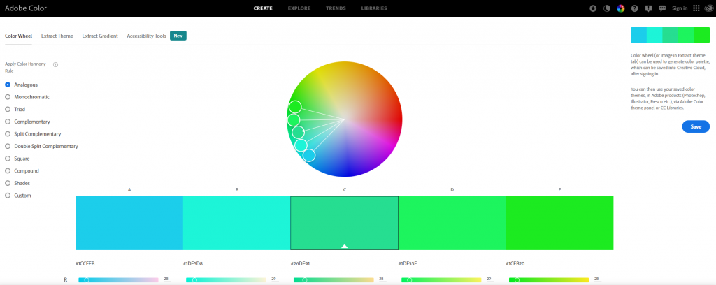
A Helpful Color Palette Picker Tool
Some of the tools that I use are pretty awesome. I’m going to use this Adobe color tool. This is a free tool to help me create wonderful palettes for my web design color palette. This color palette will help me create wonderful color combinations that look good together.
For example, let me take True-E as an example. I didn’t make this website but it has a wonderful color palette of an orange, a dark grey, and white. The grey and whites highlight the orange color by making it stand out more. An example of this is some of the headings in the website. The grey is used as a background color for simple text while the orange makes the important stuff pop out and stand out. This creates the attraction of the eyes of the viewer to highlight and remember the important points. During dark areas, the text would be orange and white. With the white being more readable than grey in darker backgrounds, the white serves as a replacement. Having dark and light backgrounds makes the website more interesting. Imagine a website with only black text and white backgrounds. It would be very boring. Unless a professional web design team designs it to make it into a vintage theme, it has a high chance of being very boring.